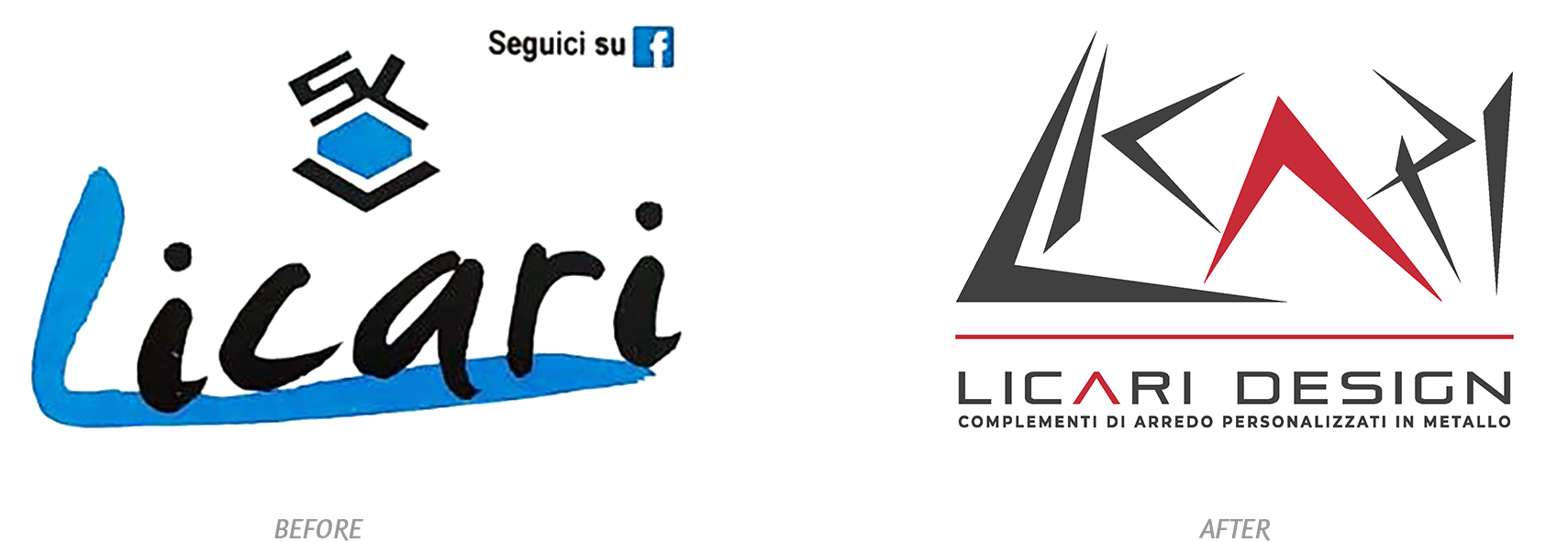
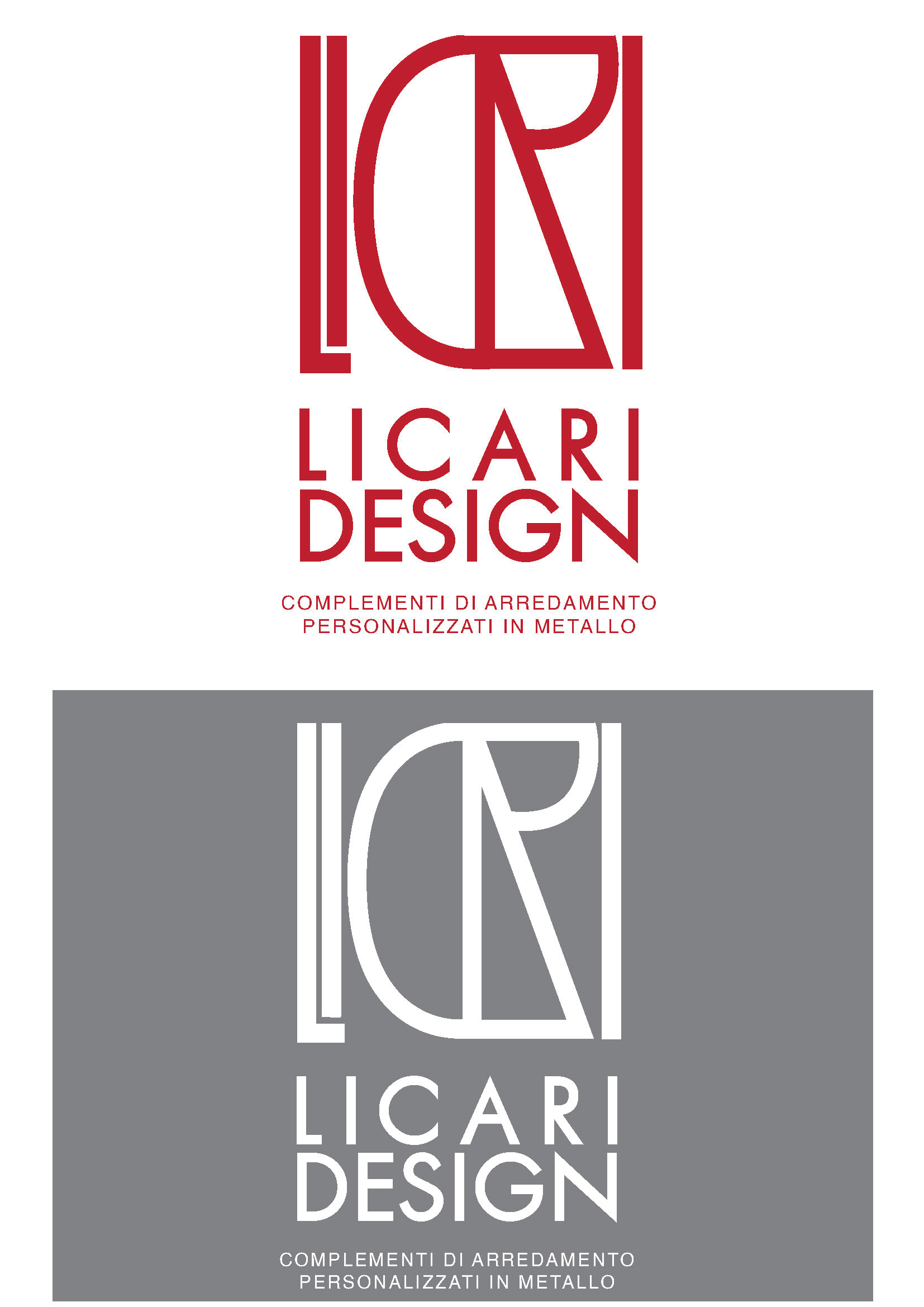
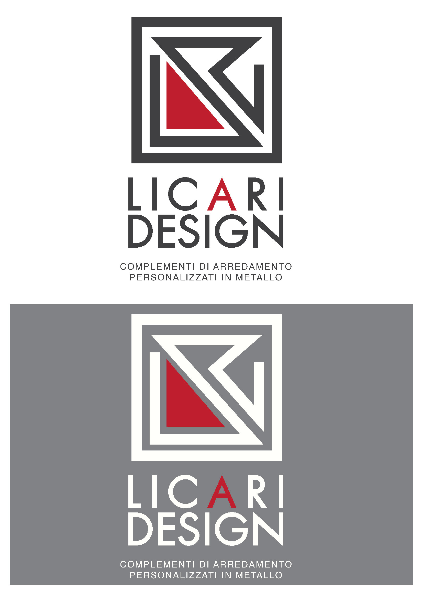
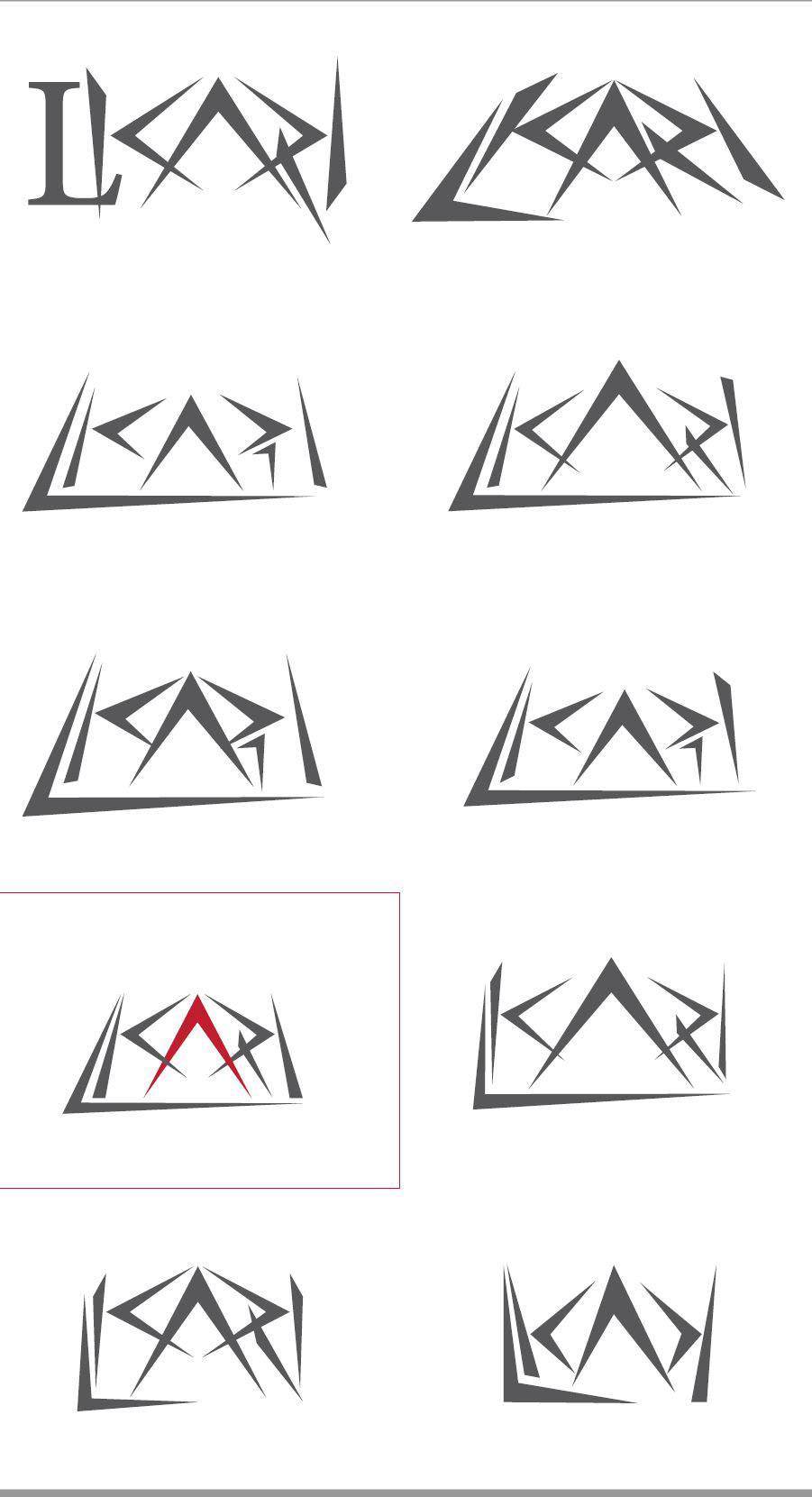
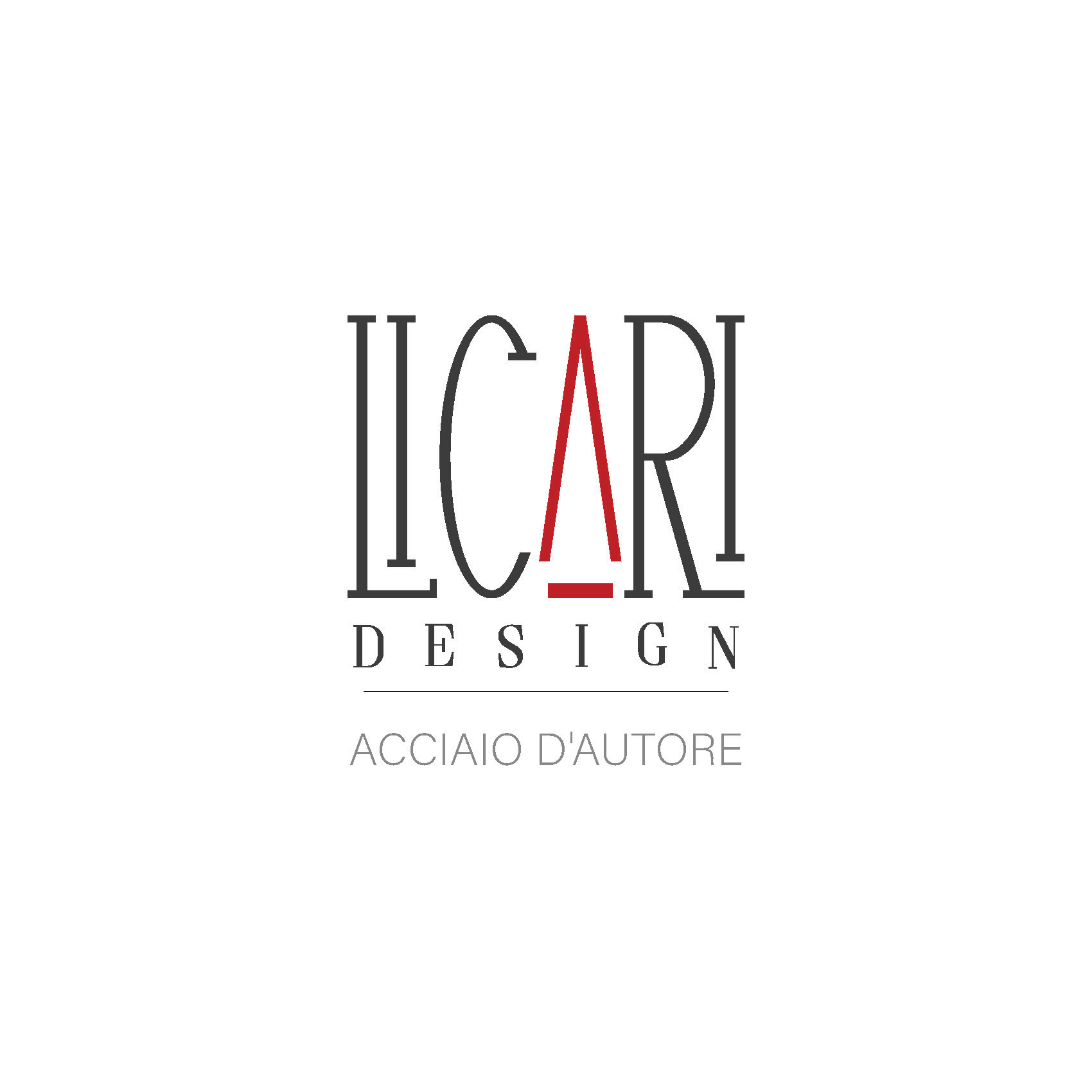
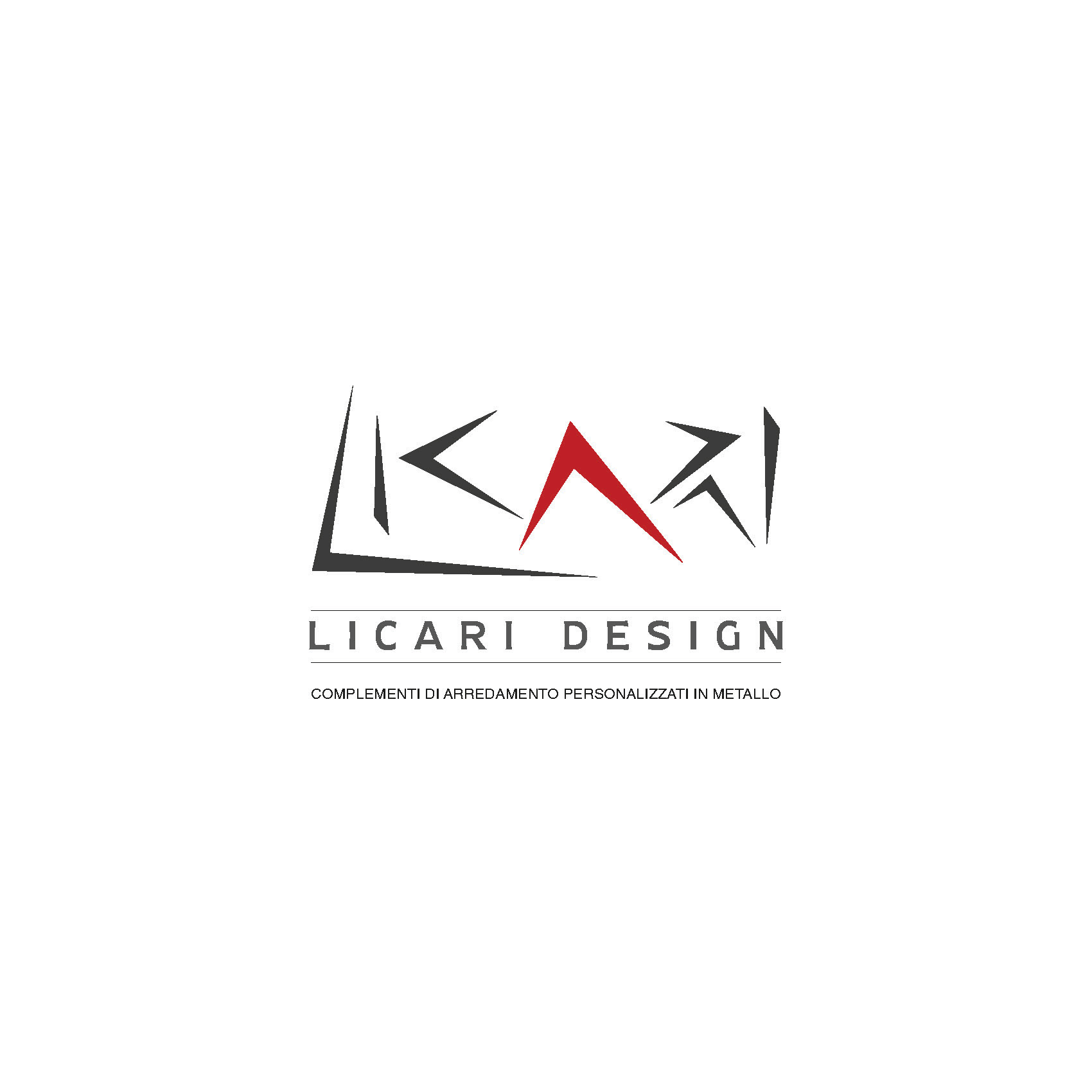
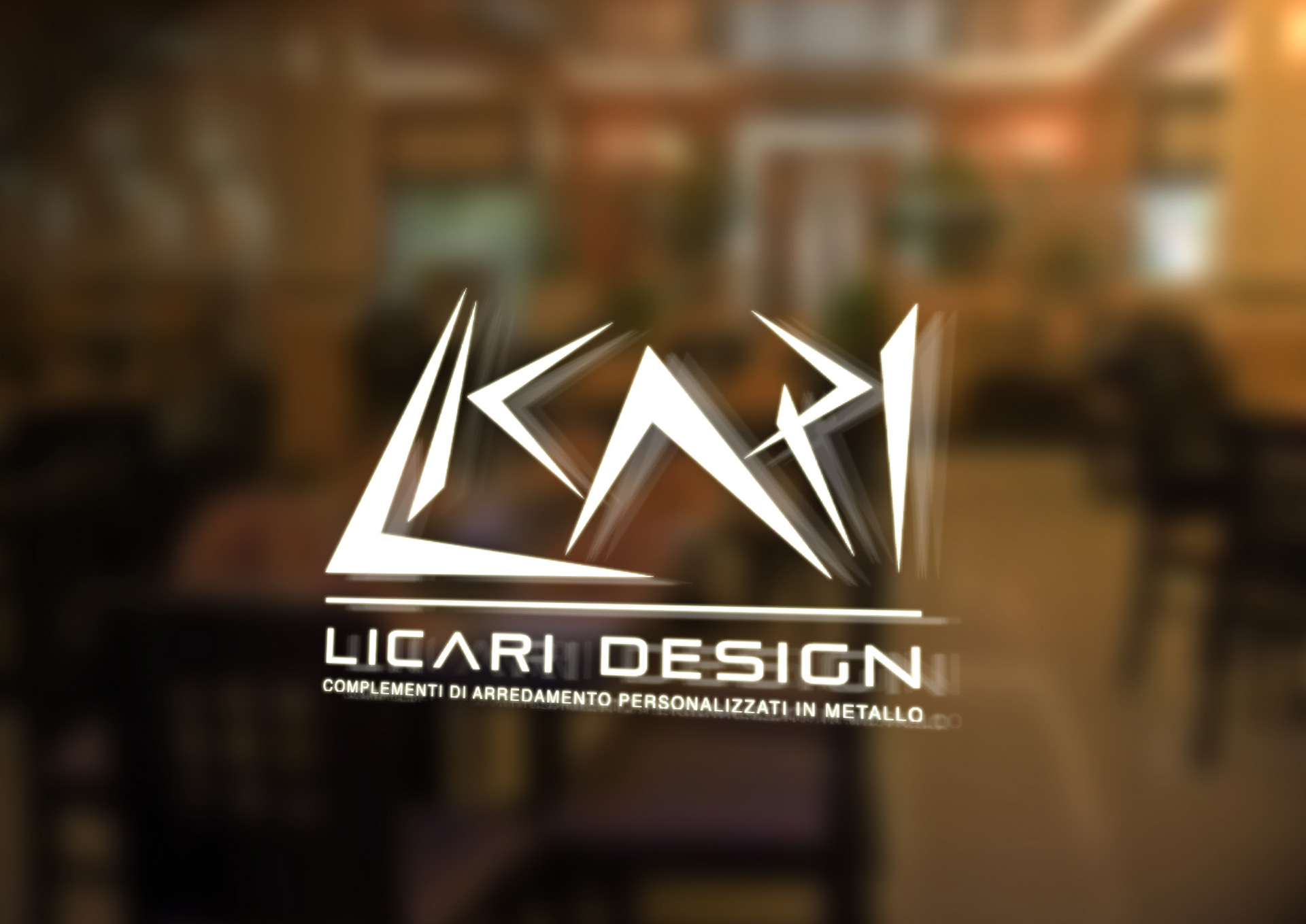
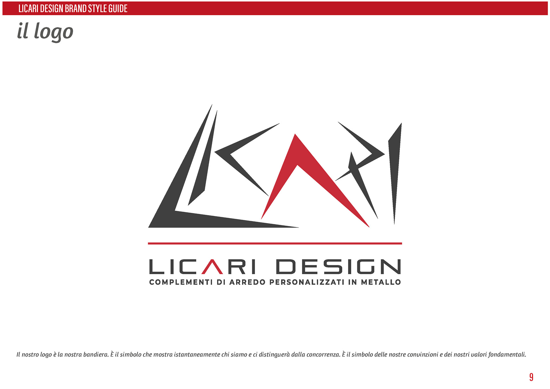
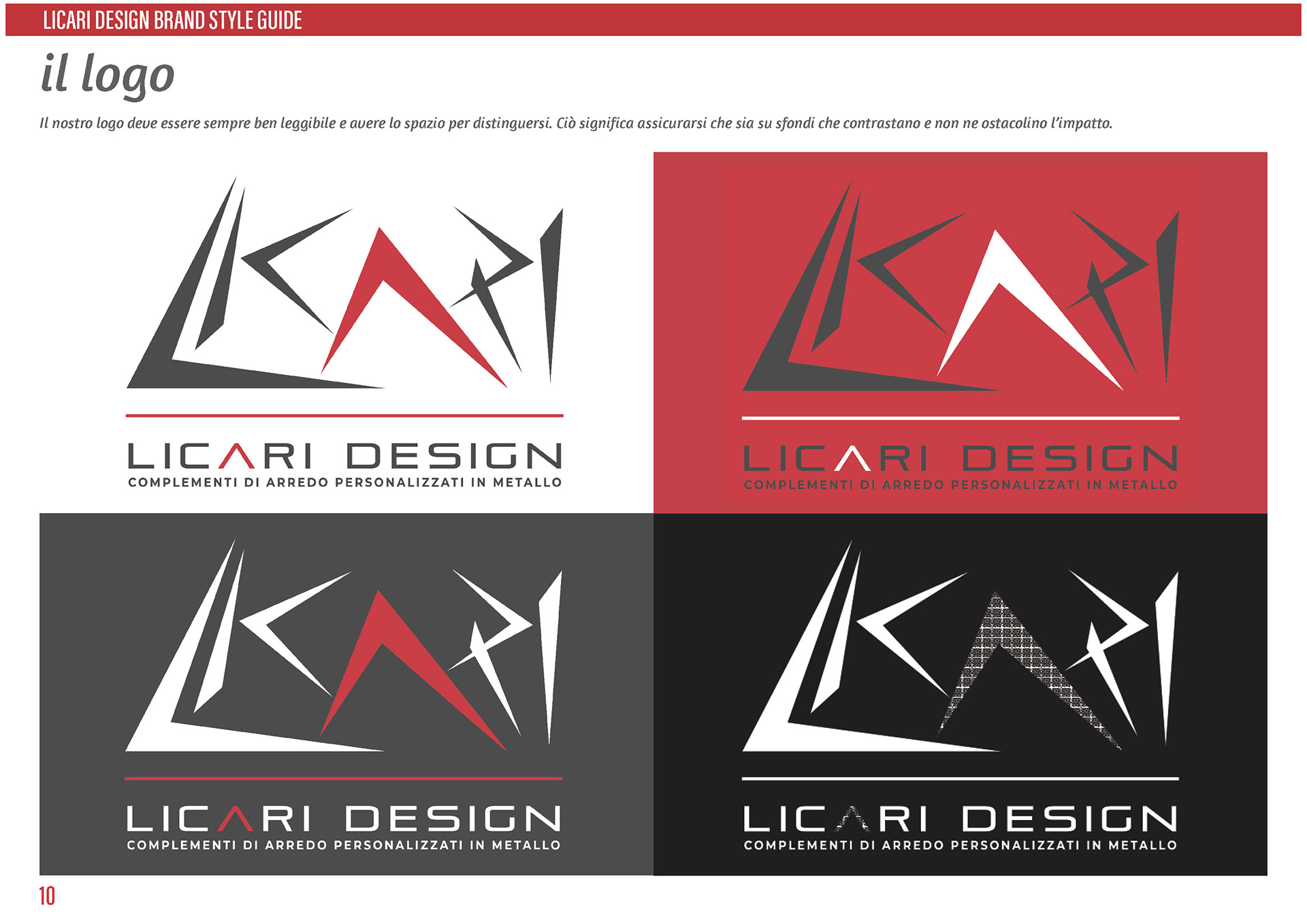
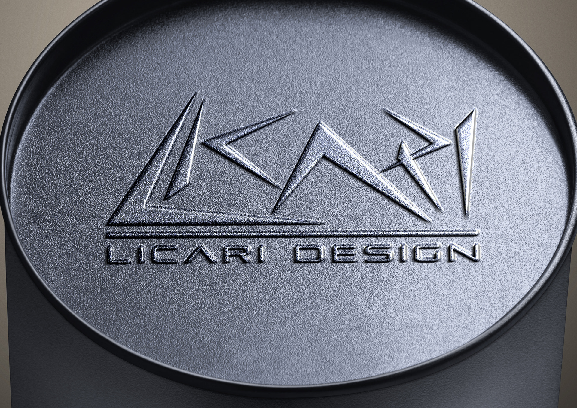
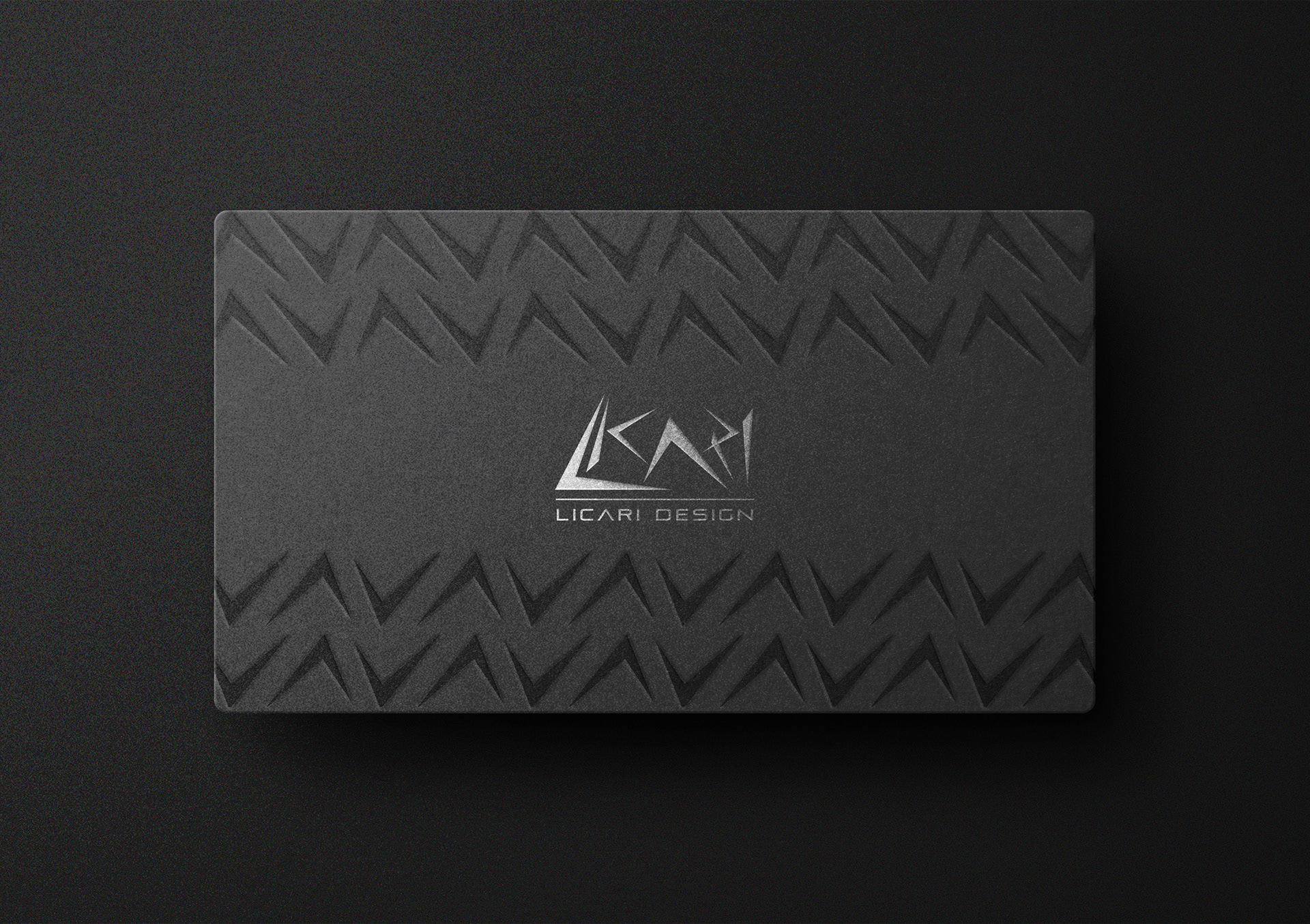
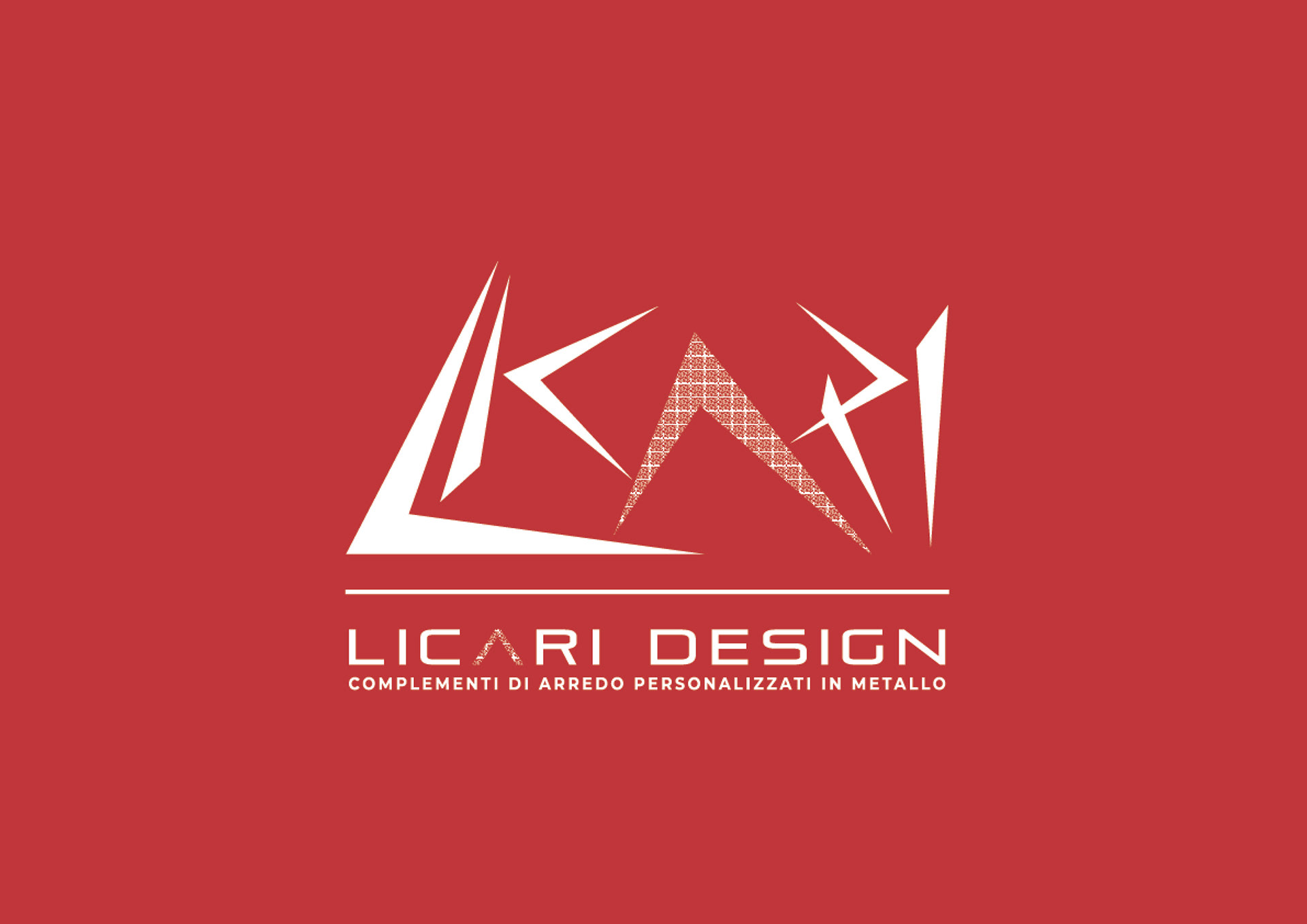
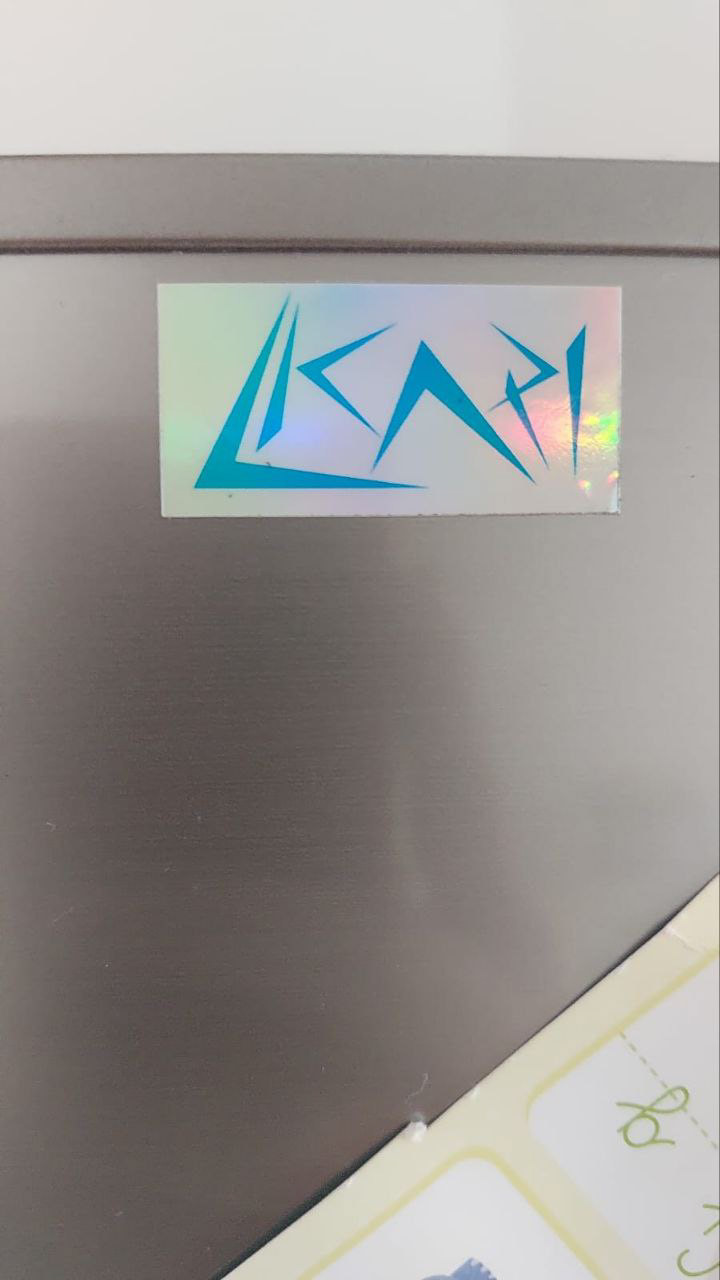
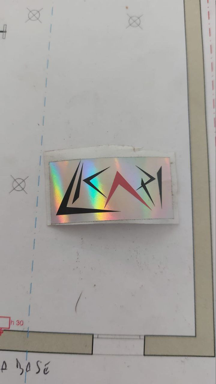
The logo of Licari was created using an approach based on the technique of tracing the marks left by the flex on the metal during cutting. This technique was used to create the stylized "Licari" lettering, with clean and straight lines that resemble the typical engravings left by the flex on processed metal. This element gives the logo a distinctive and refined appearance, highlighting the company's expertise in metalworking.
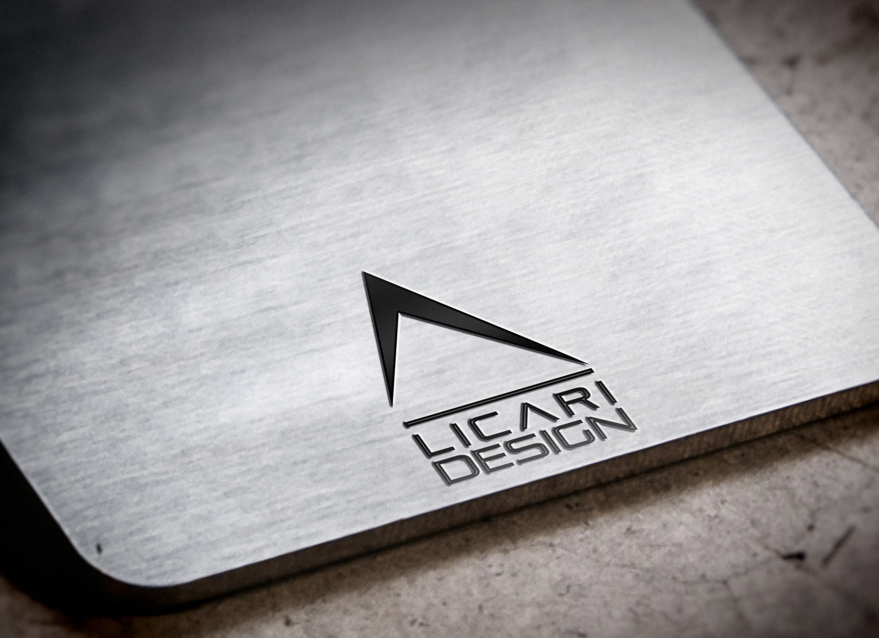
The letter "A" in the logo is designed in a special way, with a geometric shape that resembles a stylized flame in red color. This element adds a touch of dynamism and energy to the overall design of the logo, evoking the alchemical symbol of fire, which represents the importance of fire in steel production, the main material used by Licari.
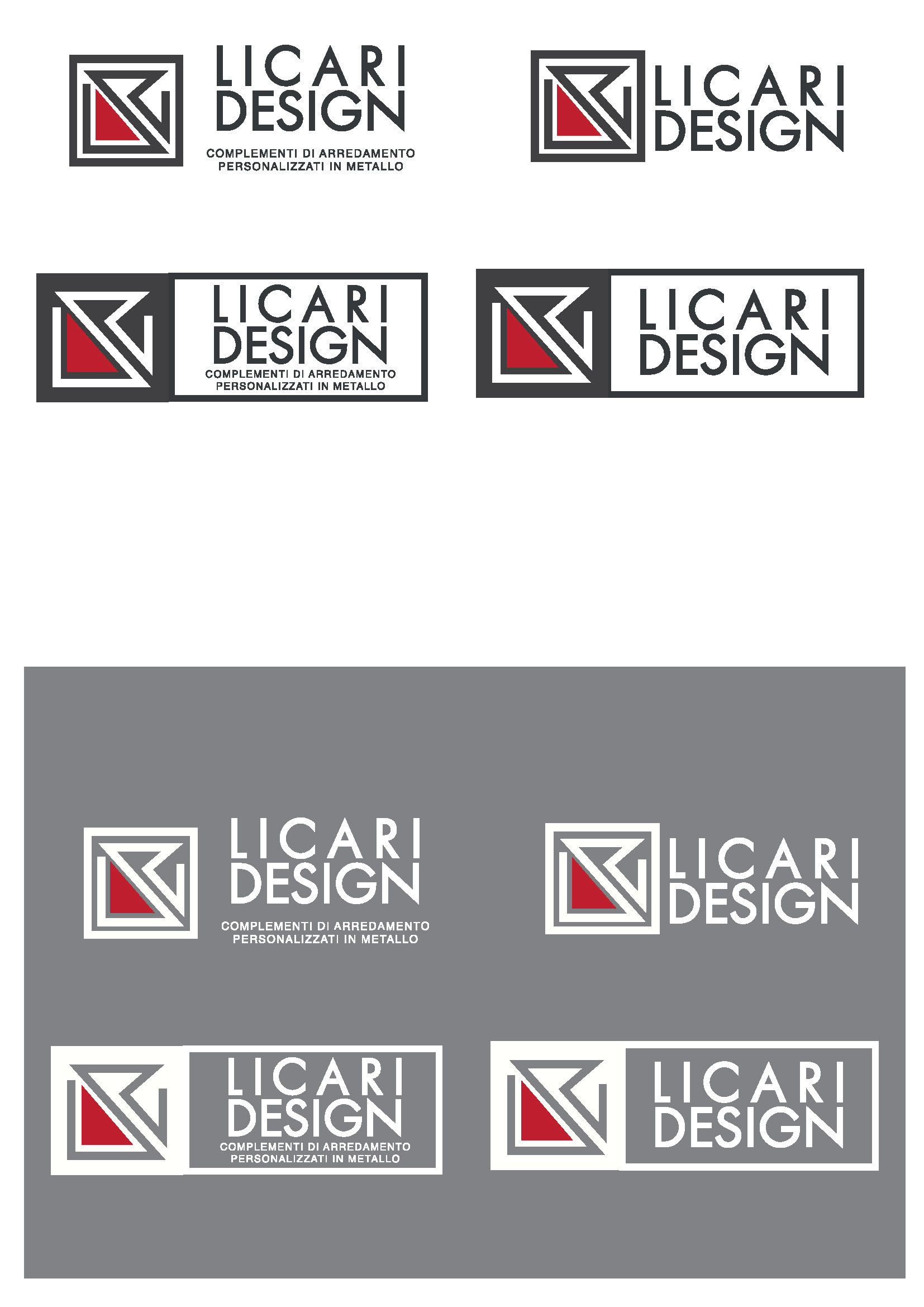
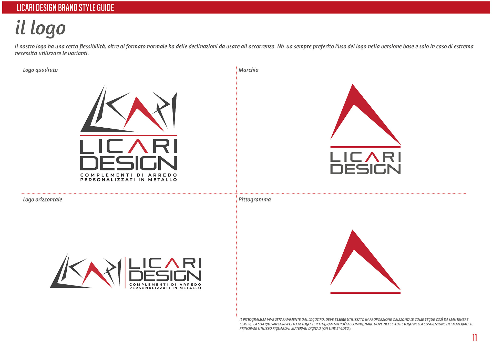
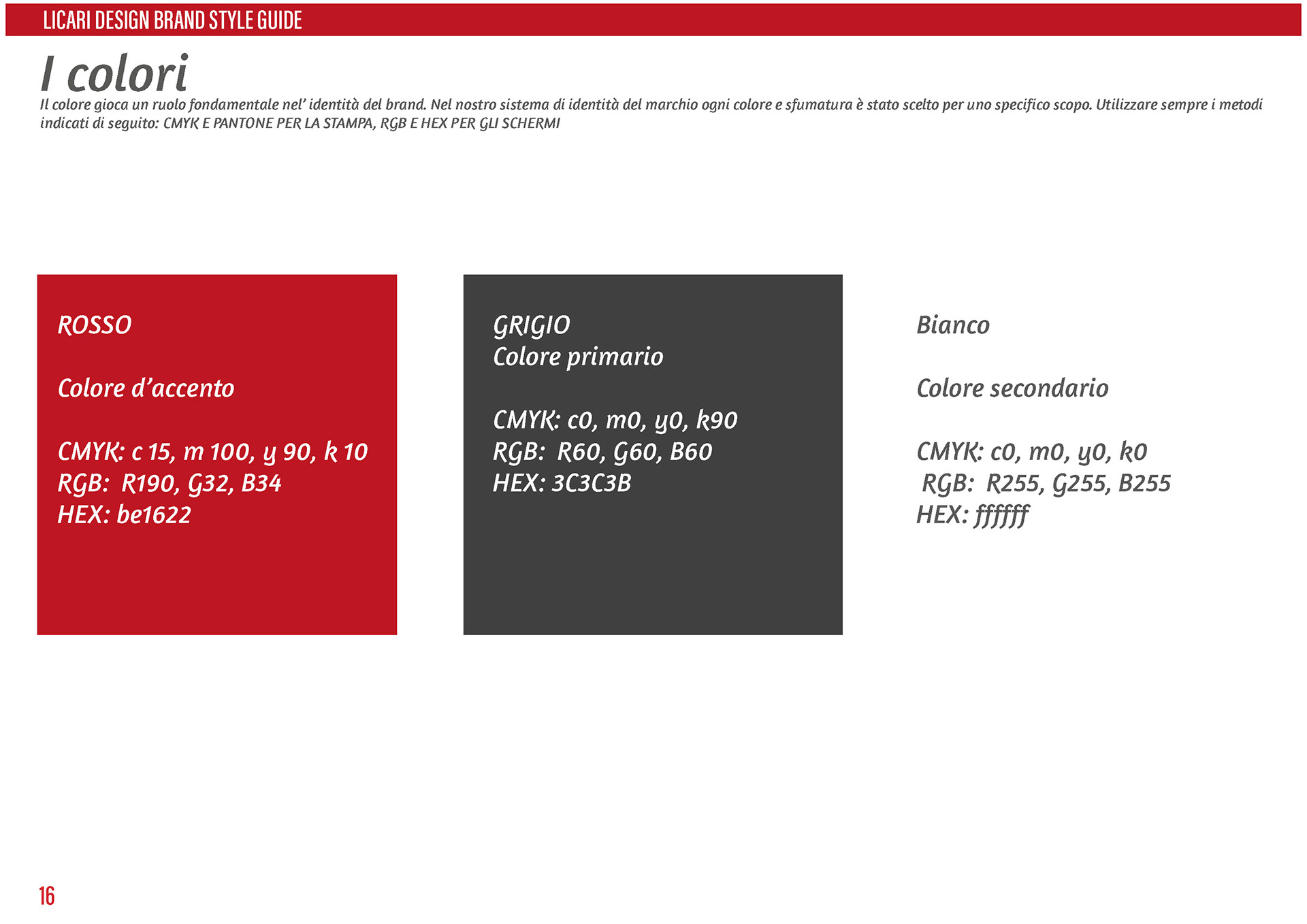
The logo uses a simple color combination, with black as the dominant color and red used only in the letter "A". This color choice gives the logo a modern and sophisticated look, highlighting the distinctive feature of the red color in the letter "A".
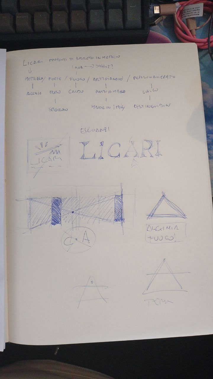
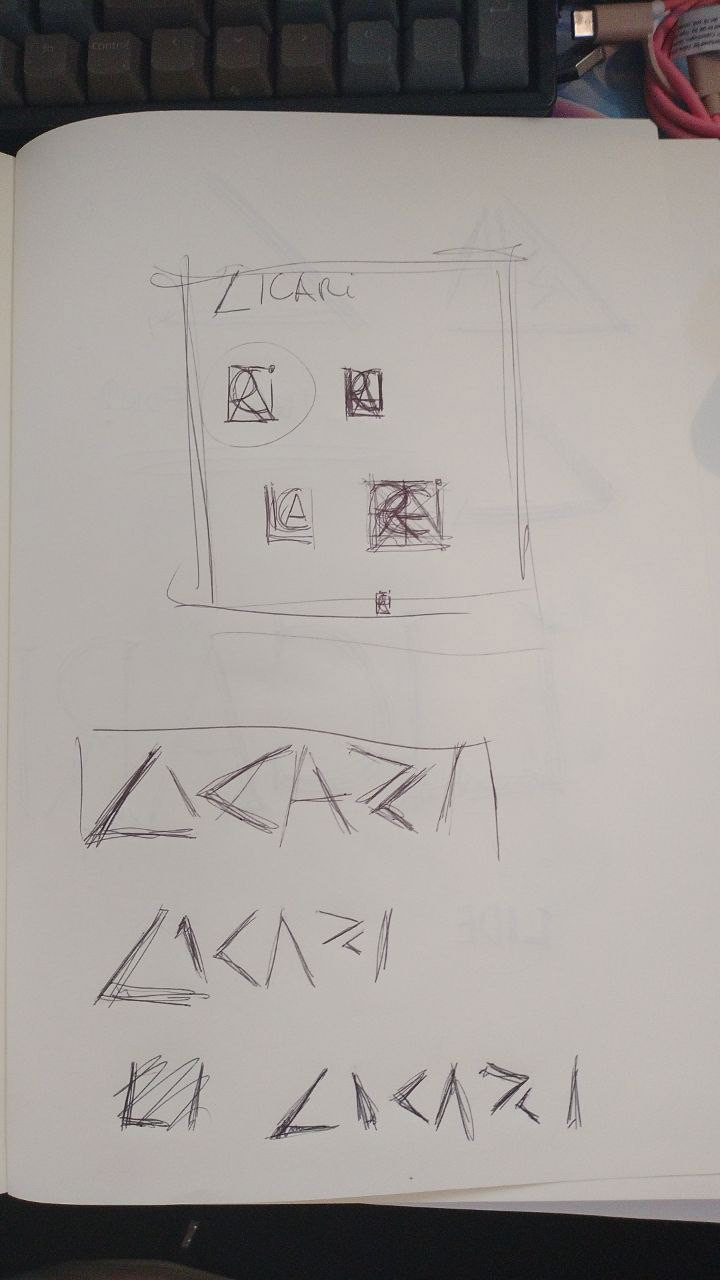
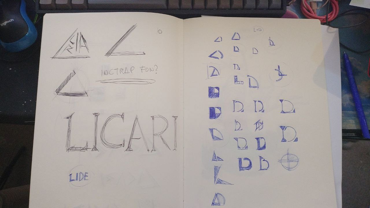
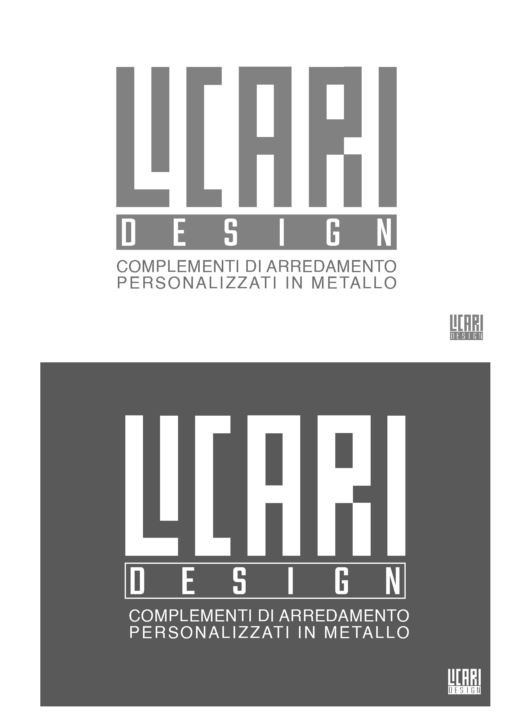
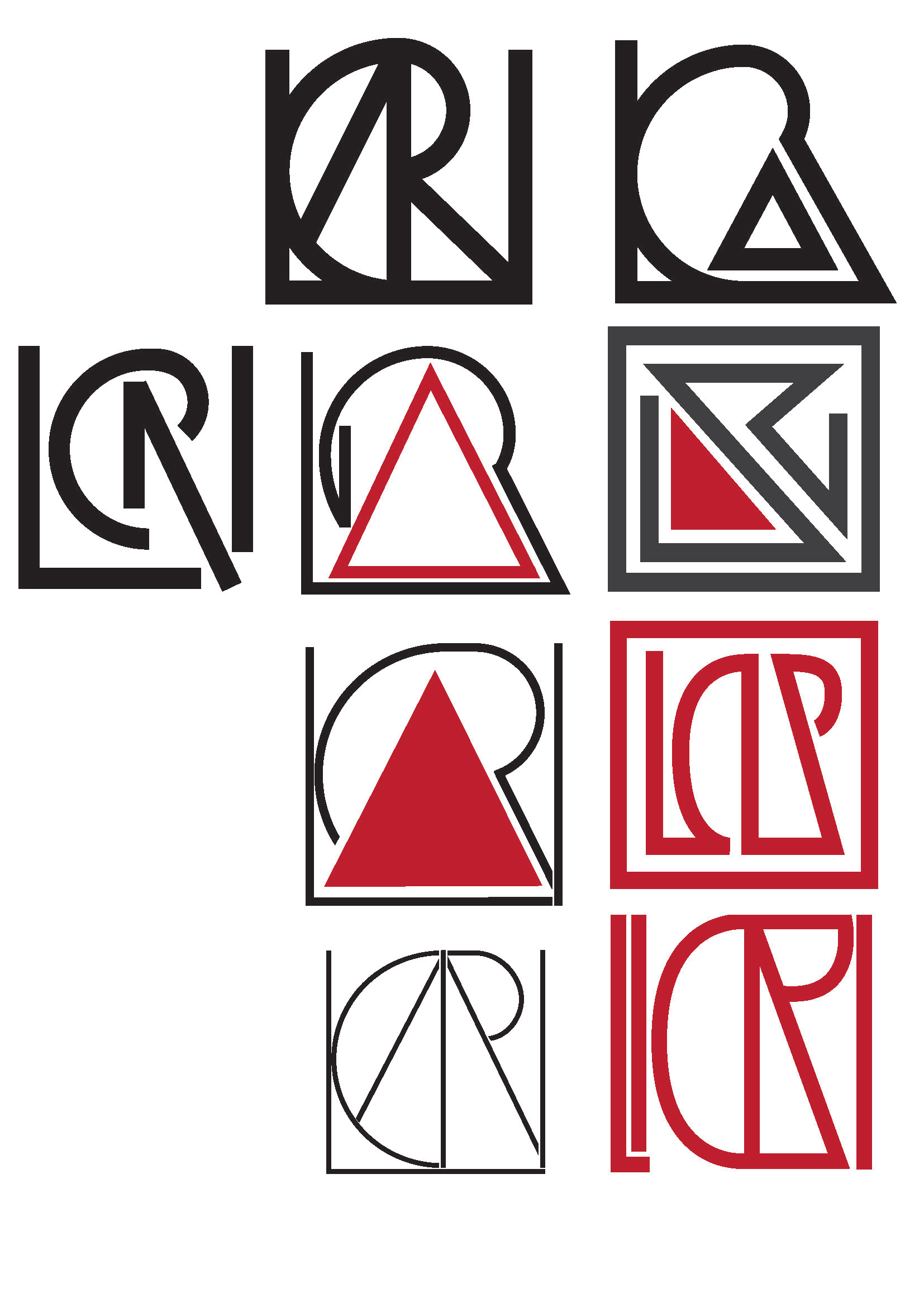
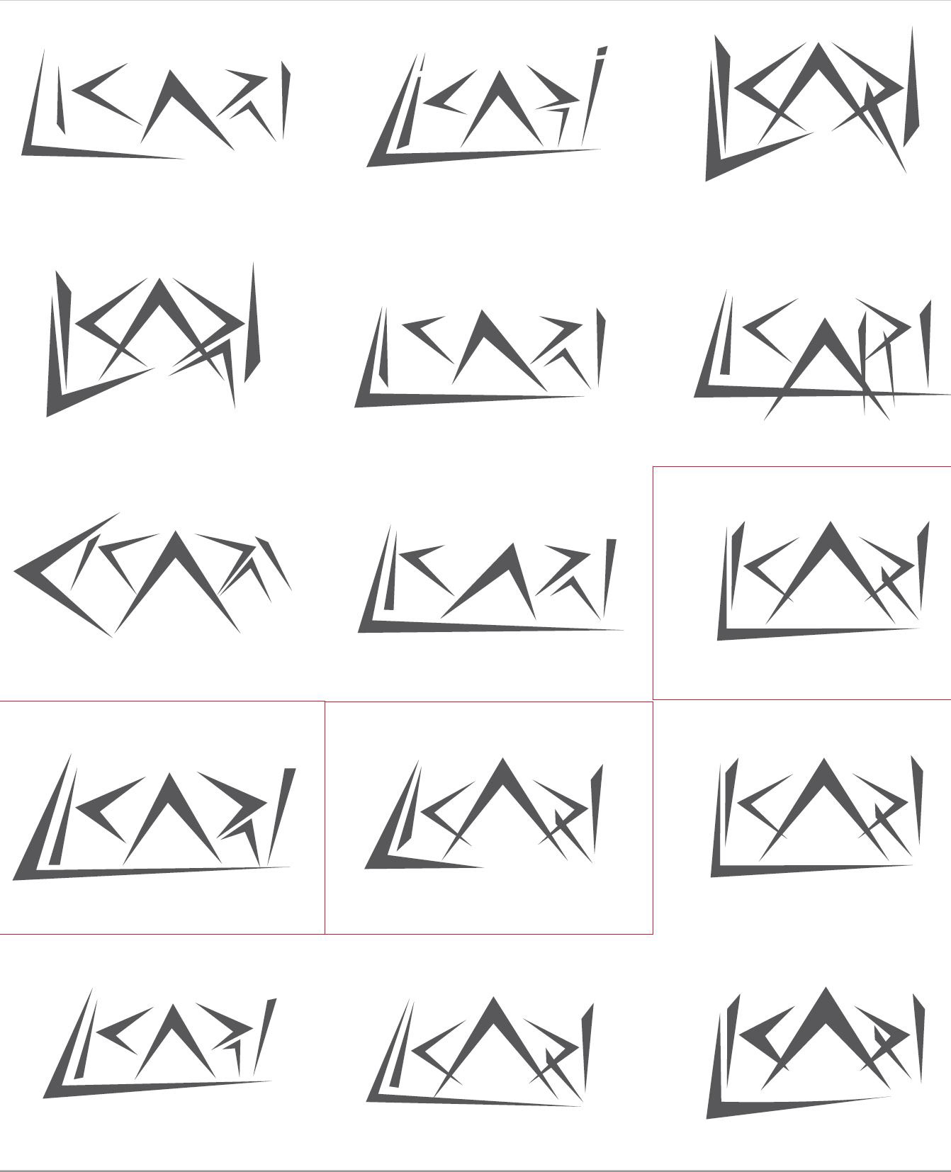
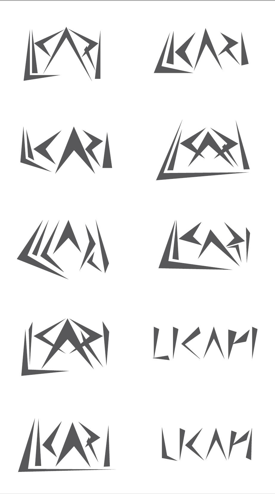
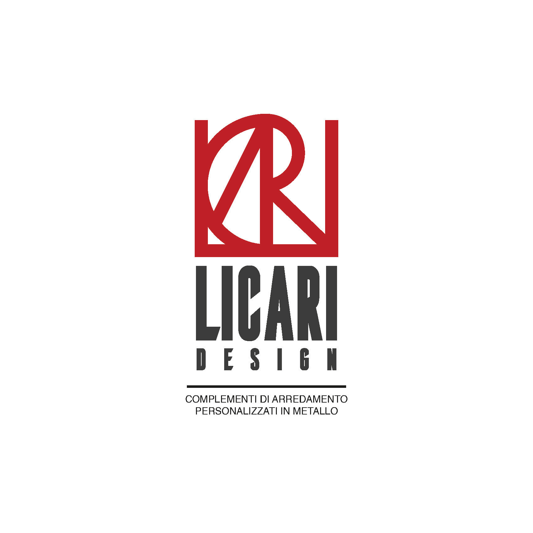
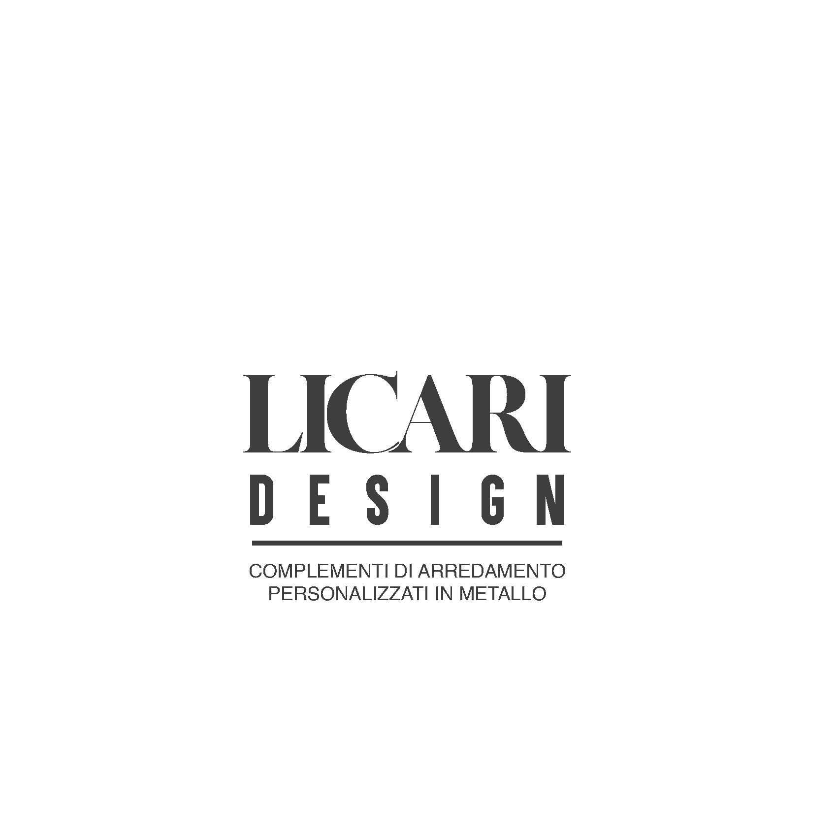
quick drafts and hand drawings
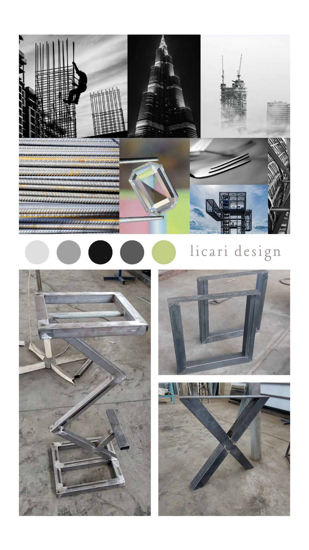
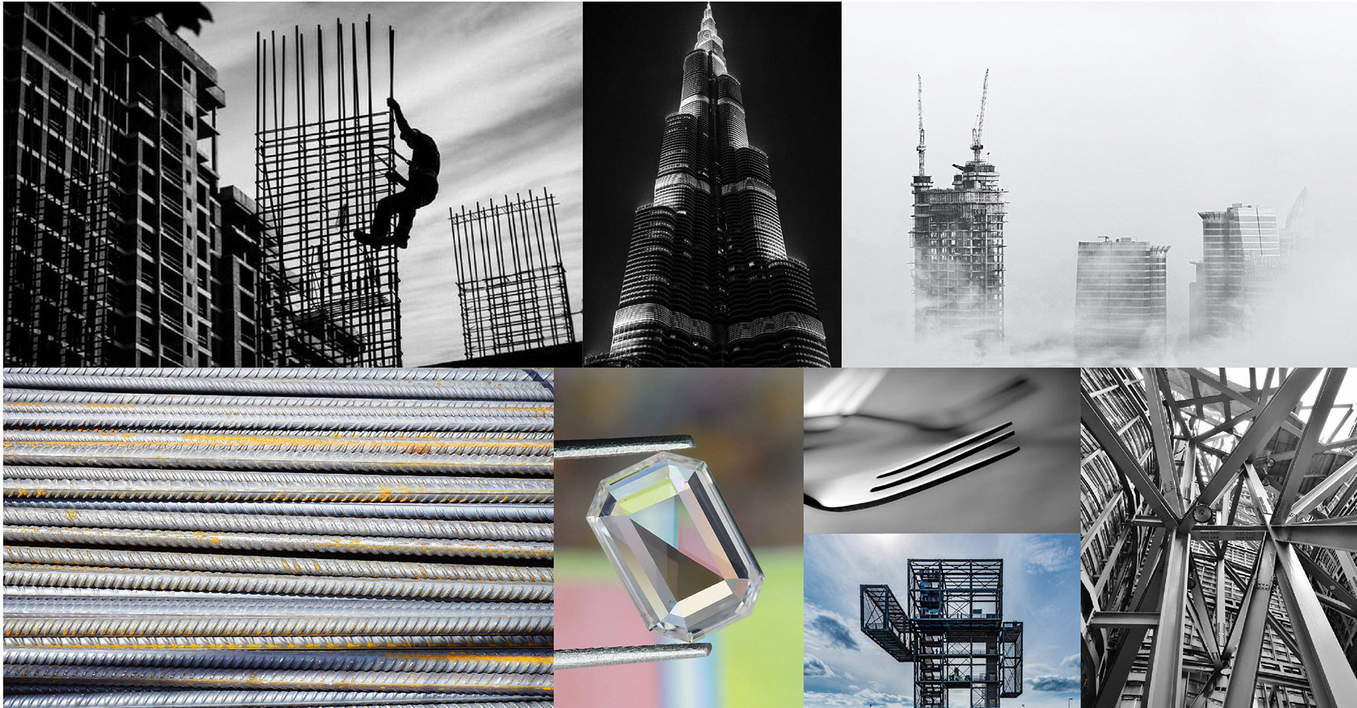
mood board
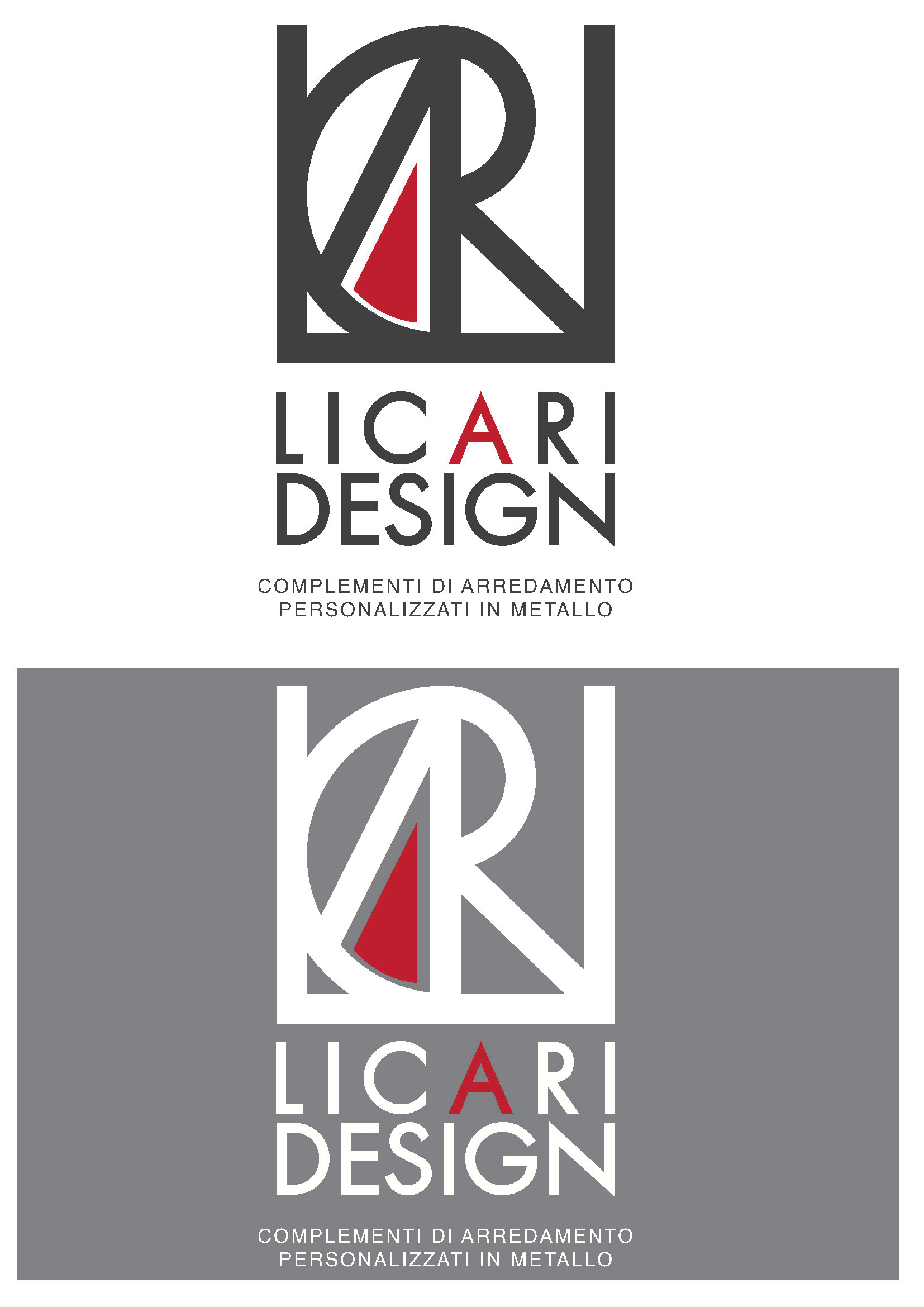
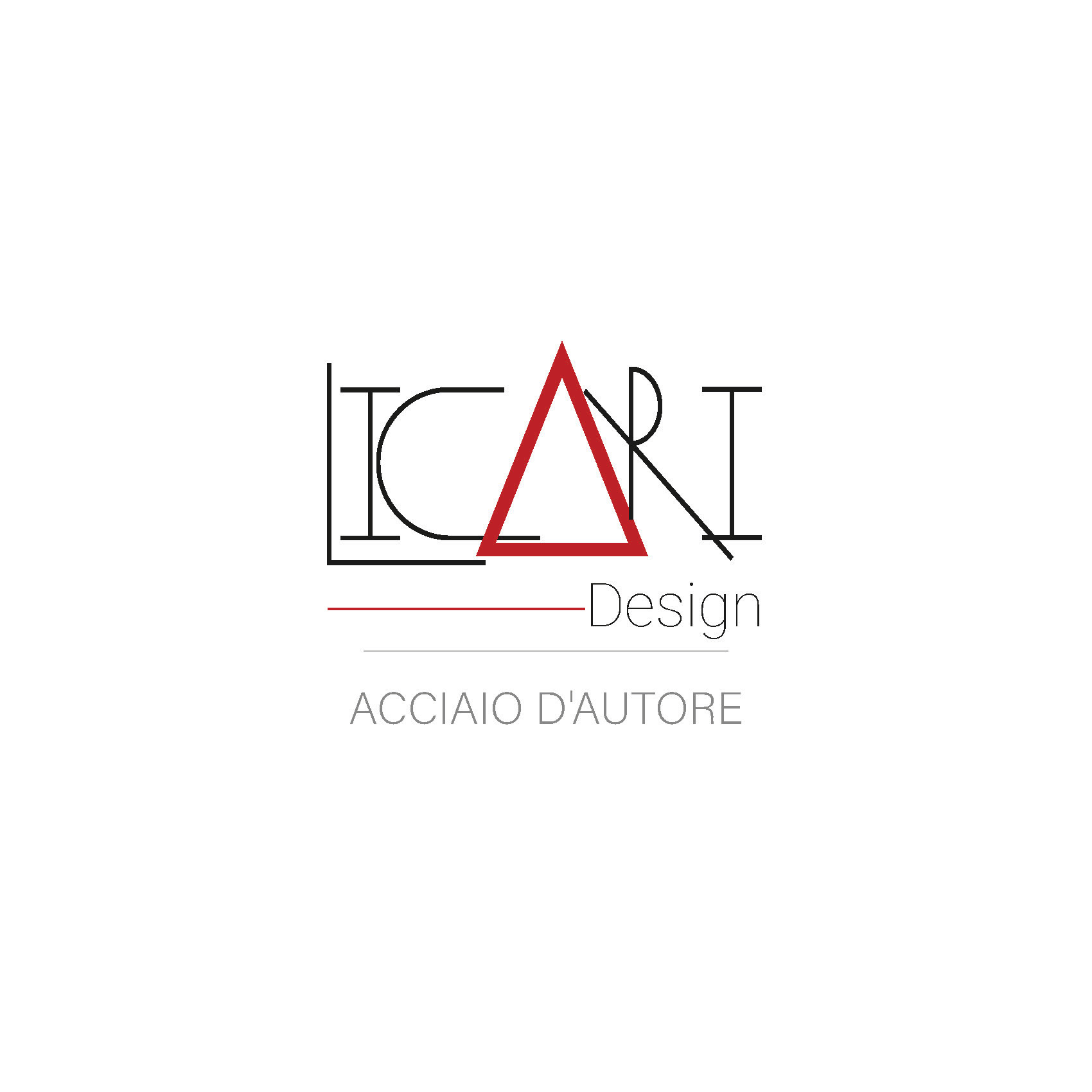
quick illustrator test
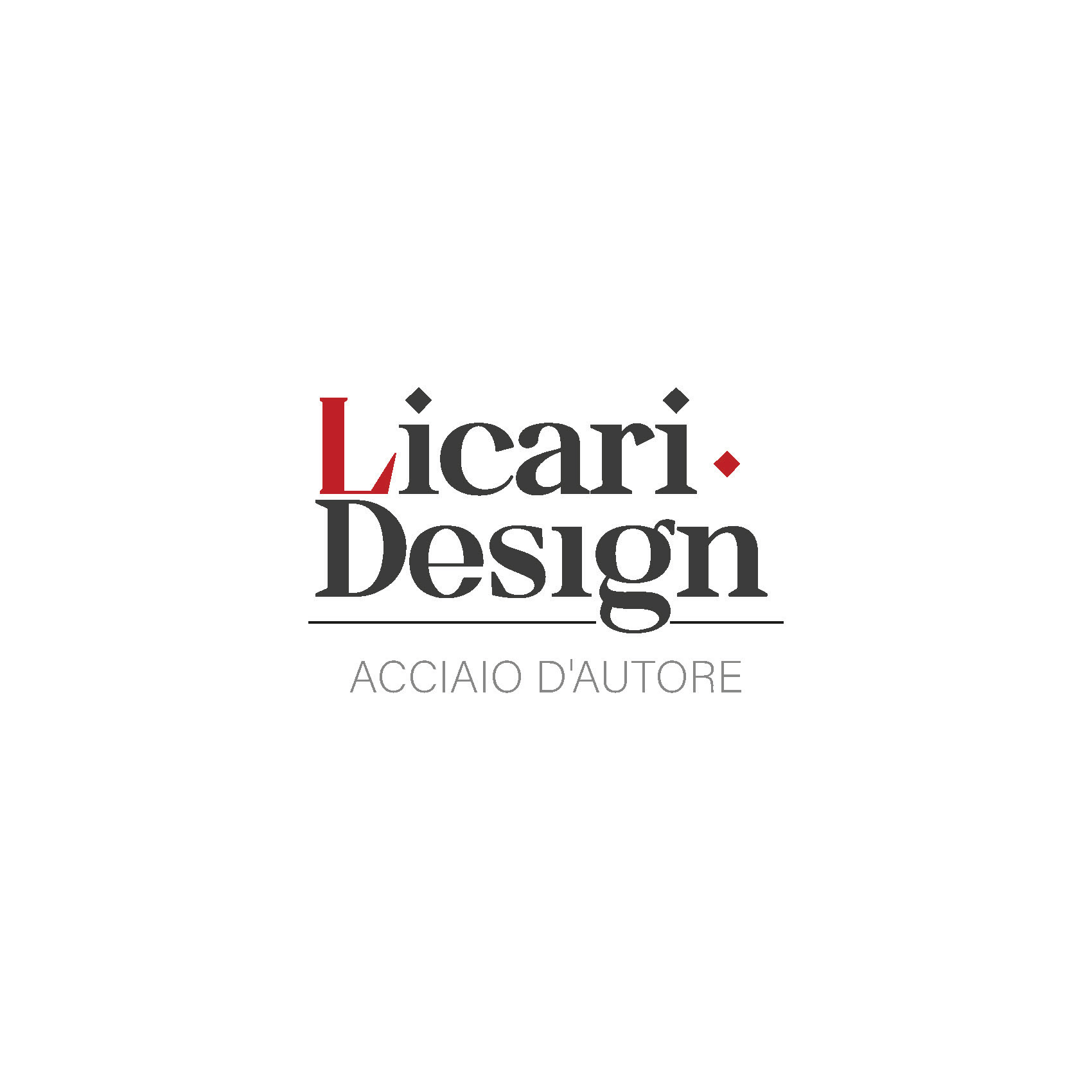
final client proposal
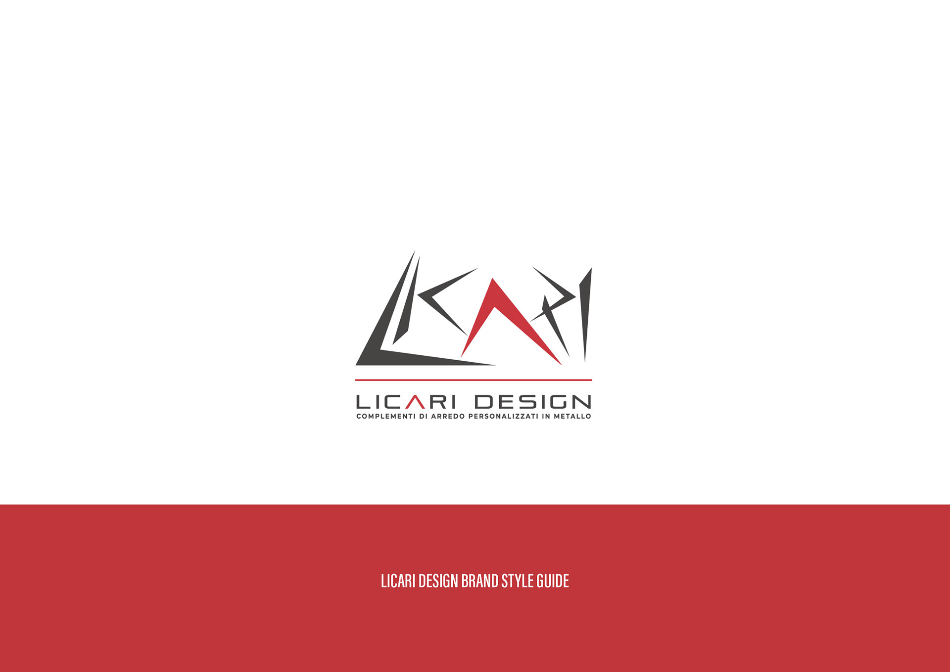
brand guideline and brandbook
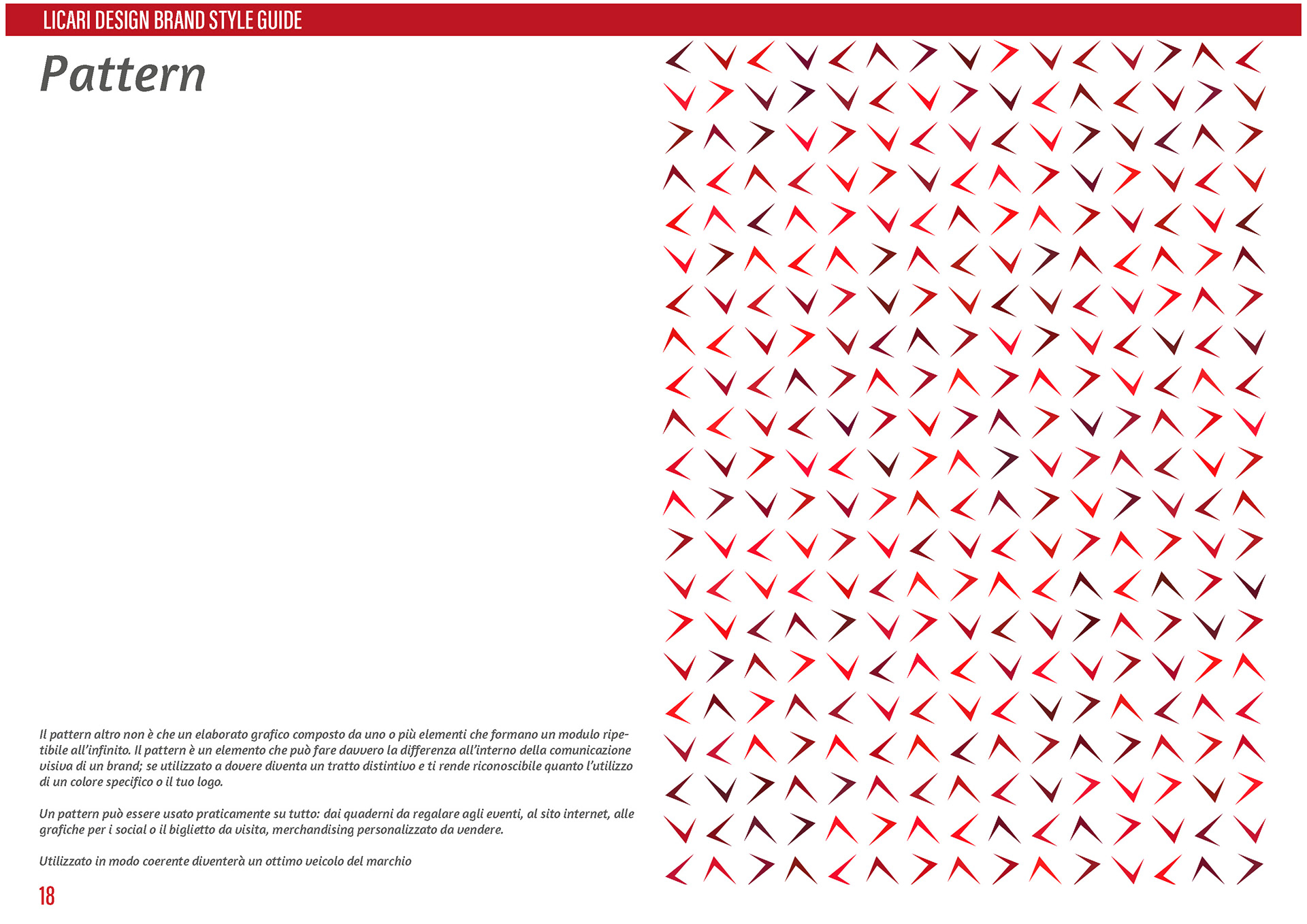
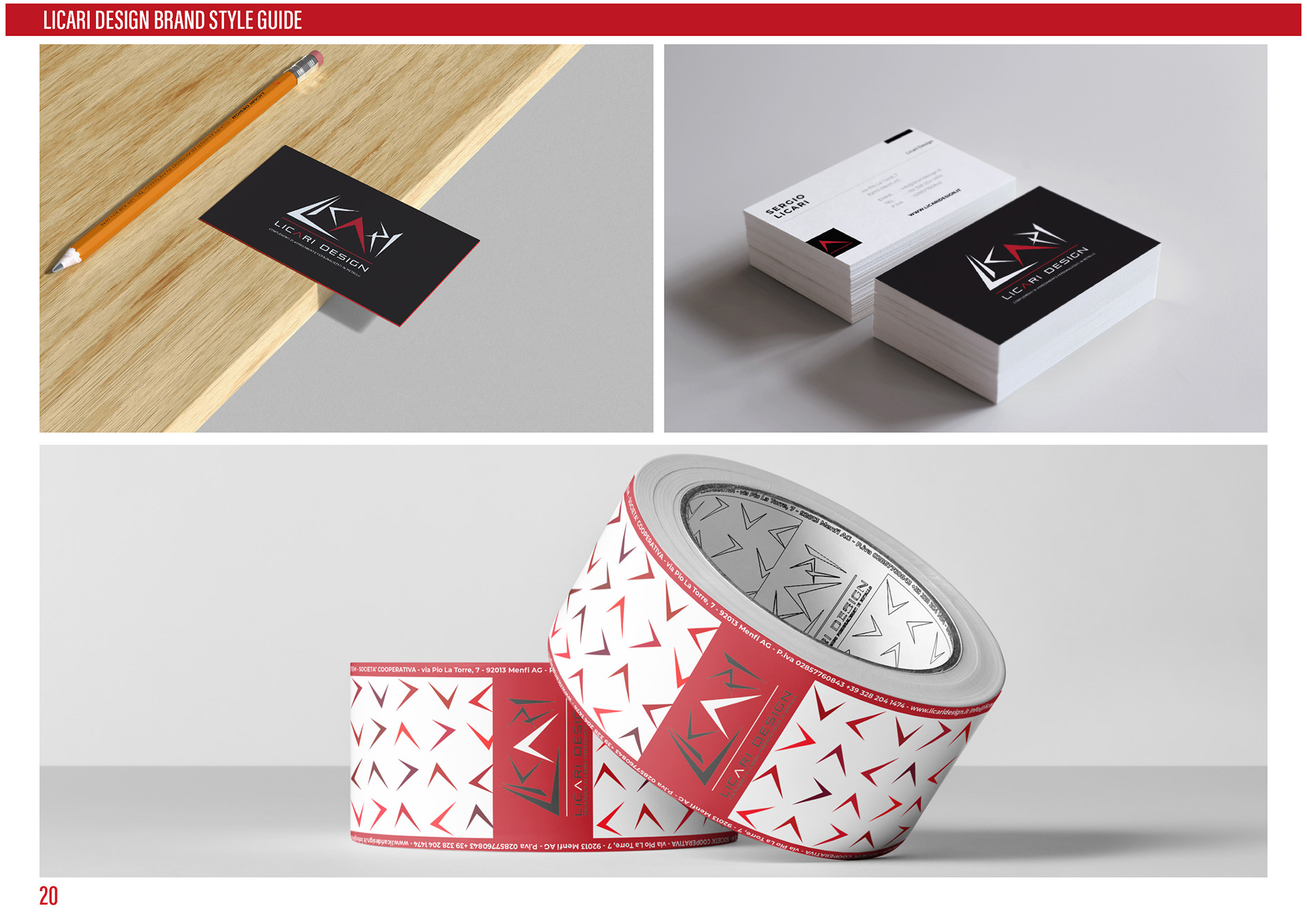
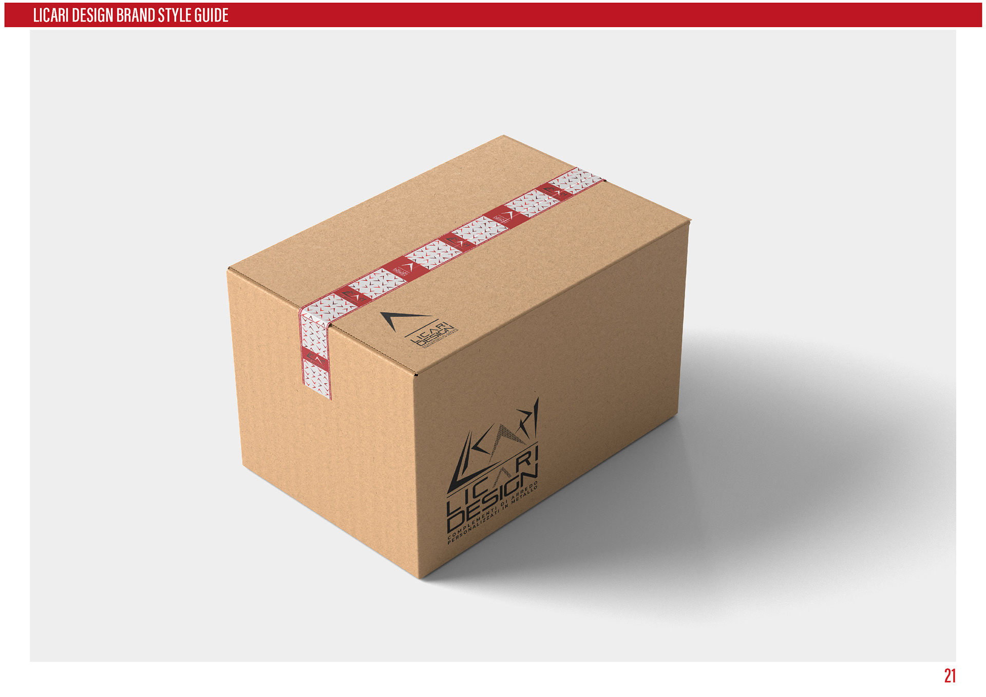
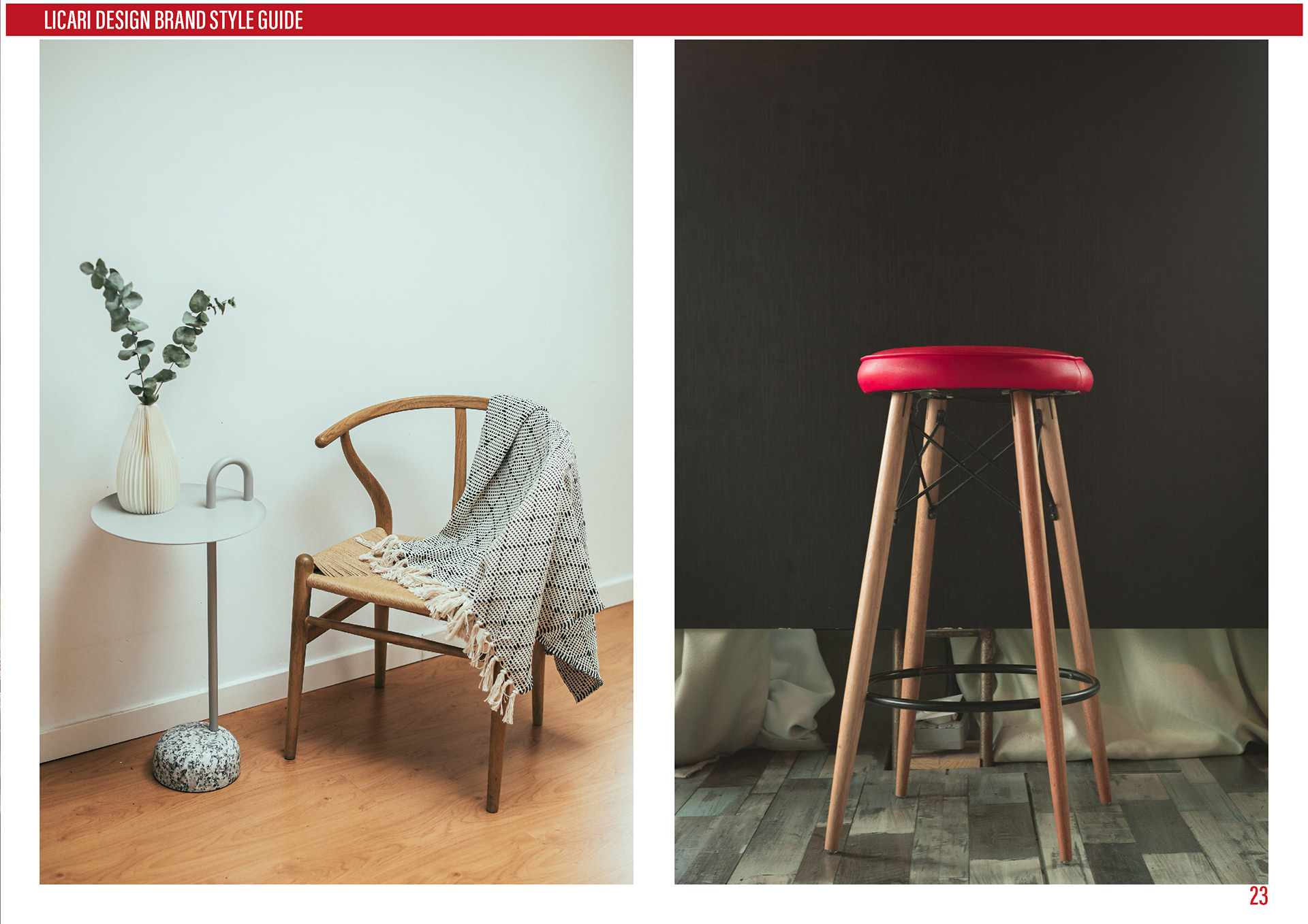
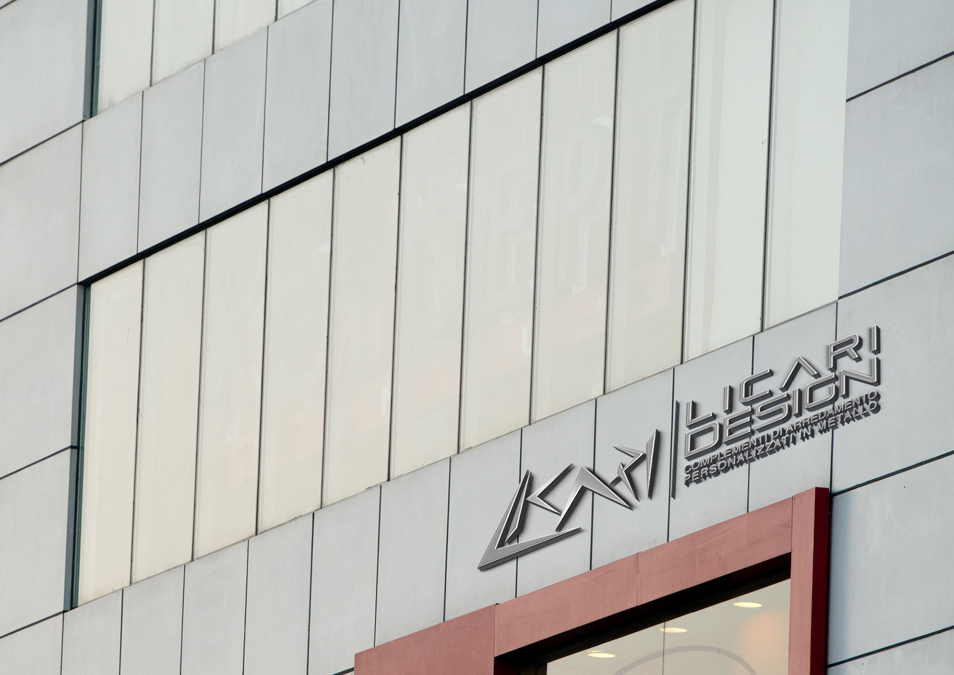
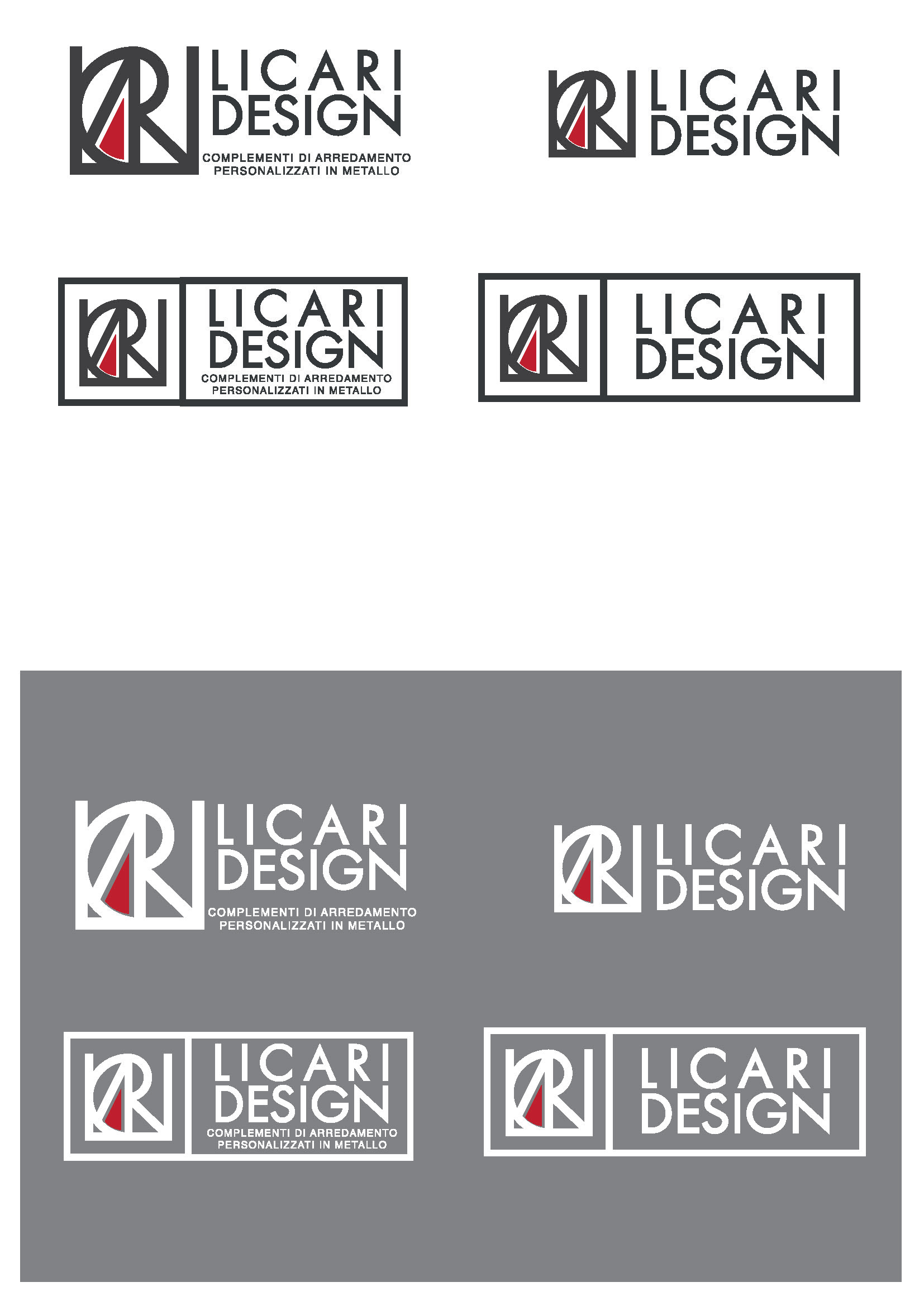
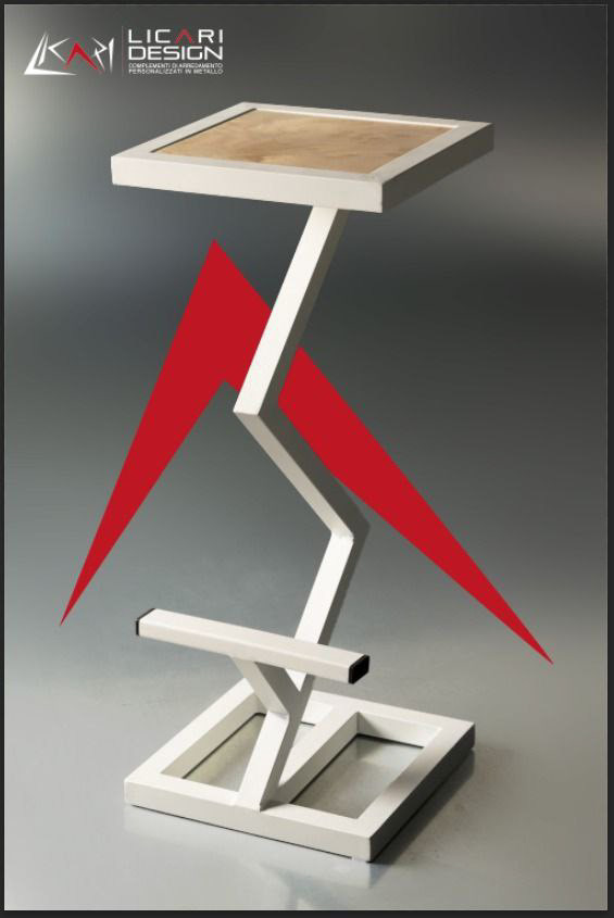
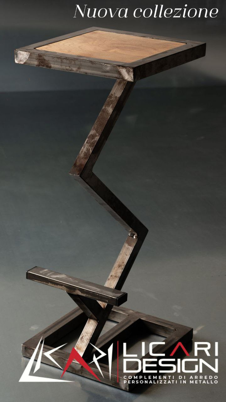
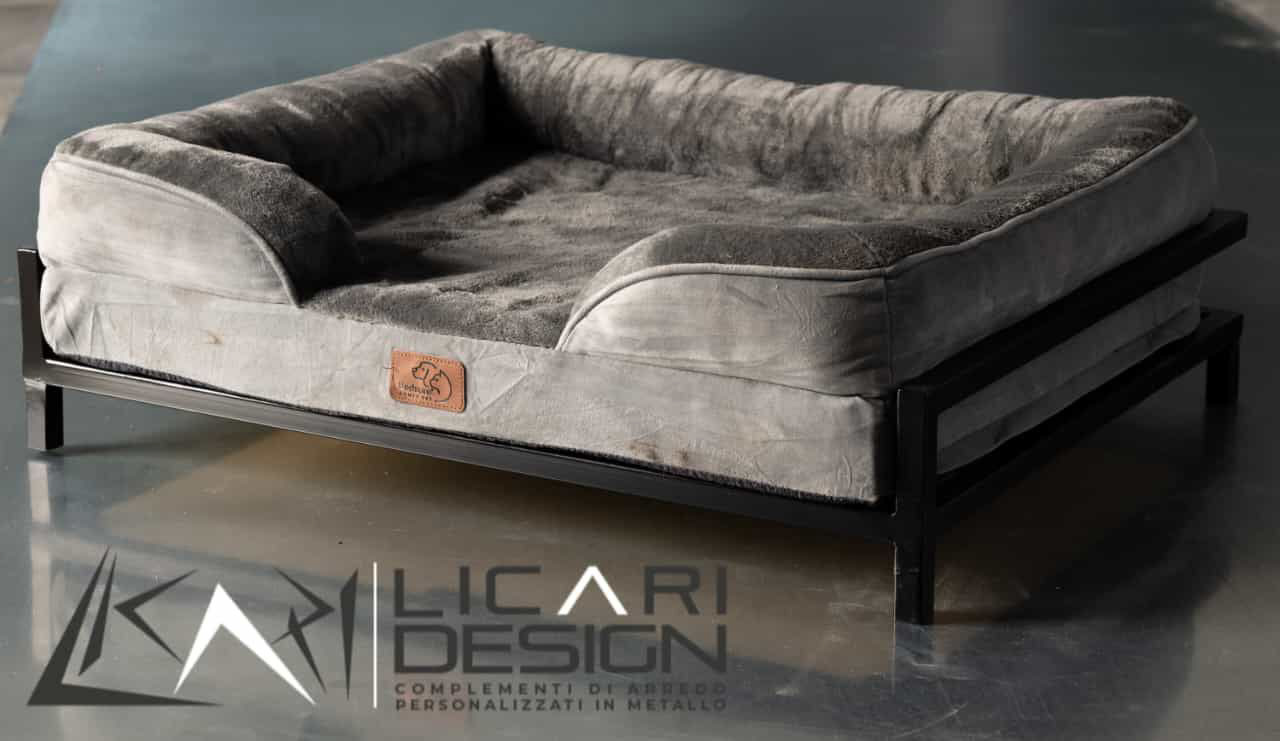
pratical use


thank you